JitBlox 1.5: Angular 20 support, new components and more UX improvements

I'm happy to announce another point release of JitBlox, with support for Angular 20, more Bootstrap components and even more UX improvements. No new major features, but another usability improvement that makes building component-based web UIs easier for you. In the meantime, we're quietly working on our next big milestone: an AI assistant 😀. Imagine generating a Tailwind or Bootstrap app (or parts of it) with AI, without being stuck with code you can't make sense of... Stay tuned for updates!
If you're not already familiar with JitBlox, it's a visual web app builder that lets you build working web apps without coding, leveraging leading UI libraries and front-end frameworks. JitBlox is an easy way for you and your team to quickly build new ideas and start your next web project with solid source code and UI components that developers are already familiar with.
Angular 20 support
Angular 20, released at may 28th, is the latest release where the Angular team has focused on some of its in-progress features for a better developer experience. It's good to hear that the Angular team continues to improve. As you've come to expect from JitBlox, we strive to support the latest version of frameworks and libraries, and this new major Angular version is no exception. Starting today, every new JitBlox project will target Angular 20, and for existing projects you will be prompted whether you want to upgrade now or later.
Template editor UI updates
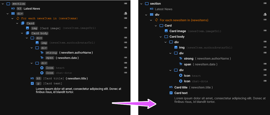
In JitBlox 1.4 we already made a number of UX improvements, and with this release we've gone one step further to make JitBlox even more user-friendly. The main change is in the template editor, in which we simplified the Elements tree by leaving out superfluous information. This update is best illustrated with an image:

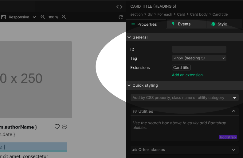
As you can see, there is now less focus on tag names, and more on the role a particular element has. For example, you can see that the Card title and Card text at the bottom are just a bit more compactly displayed, while not missing any essential information. For further details, we have expanded the details panel with an additional section that displays the element ID, tag and any extensions:

The element ID
This property was formerly named "Reference ID". We moved it out of the attributes section and renamed it to simply "ID". Its usage remains the same though, namely to uniquely identify the element within the template. The ID is only needed when other elements need a reference to this element, such as for calling any of its methods.
Changing an element's tag
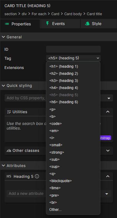
The Tag property not only displays the element's current tag name, but now also allows you to change it with one click! The dropdown will start with the options that make the most sense for the current element. Note that some components allow only a restricted set of tags, or even just one. In the latter case, the tag selector is not shown.

Seeing and managing extensions
Extensions, formerly called "Features", are an important aspect of JitBlox's flexibility. An extension adds additional functionality or styling to an element. Common uses for this include adding a tooltip, or turning a regular hyperlink into a Page Link for in-app navigation. Use the Extensions panel to see, add or remove any extensions. Here's a short video on extending an element with a tooltip.
Note that in many cases you won't need to extend an element in this way, because all extensions can also be inserted directly from the toolbox together with an element. The Page Link is a good example: when you select it in the toolbox, it is automatically inserted with a regular hyperlink element, or with another element of your choice (e.g. with a button).
New: Bootstrap Offcanvas and Modal support
We've added two special components to our Bootstrap integration: the Offcanvas and Modal components. What makes these components special is that they are not initially visible to the user. Showing them requires a trigger - such as a button - and some additional JavaScript code to open the component when the button is clicked. Both components are now easy to add to your Angular app from the toolbox with a few clicks. You'll find a short how-to (and a half-minute walkthrough video) in this blog post.
Other changes
- Improved code generation of HTML code. Our updated HTML code generator generates more compact - but still readable - HTML and fixes some issues with unwanted whitespace.
- Bootstrap only: we've added some new Bootstrap utilities to our quick styling panel: a new Position utility group and a new Color Mode utility. Color modes were introduced in Bootstrap 5.3 and make it easier to set a light or dark mode on an individual element, no matter the global color mode.
- Bootstrap only: added the Bootstrap Placeholder component, a loading placeholder for your components or pages to indicate something may still be loading.
Join the conversation
We encourage you to share your feedback with us, good or bad, by submitting issues or leaving a comment on this post. This will help us improve JitBlox and fine-tune our roadmap, so please let us know what you think.
Read next
Building in-app navigation with JitBlox has become easier: file-based routing explained
Learn how building in-app navigation with JitBlox has evolved, including predictable paths, nested navigation, and path overrides — no code required.
Angular 21, smarter AI, and what's next for JitBlox
JitBlox now supports Angular 21, delivers a smarter AI assistant, improves previews, and adds new templates. React and Vue support are coming, moving JitBlox closer to a true cross-framework UI builder.
Accelerate no-code frontend development with JitBlox's new AI assistant
Our powerful visual designer now has AI integration! Accelerate AI-driven frontend development using leading UI libraries and without vendor lock-in.
A guide to using Tailwind UI blocks in your component-based web app
In this step-by-step guide, you will learn how to get the most out of Tailwind CSS, and Tailwind UI blocks in particular, in your data-driven, component-based web app without coding.
Adding a Bootstrap Offcanvas or Modal to your Angular app without coding
Learn how to add a working Bootstrap Offcanvas or Modal component to your Angular project within a minute - without coding.
JitBlox 1.4: UX improvements, an enhanced template preview and more
Announcing JitBlox 1.4, with a host of small but significant usability changes for both developers and less tech-savvy users.

Comments powered by Talkyard.