A guide to using Tailwind UI blocks in your component-based web app
I'm a big fan of CSS utilities. And if you're also a big fan of CSS utilities, you can't ignore Tailwind CSS these days - if only because it's a somewhat opinionated tool. Despite the sometimes good counterarguments, I am convinced that CSS utilities (and thus Tailwind) are a huge productivity gain, which is why JitBlox encourages the use of CSS utilities and has also fully integrated them into its editor.
In addition, JitBlox also encourages you to divide your app into reusable components, so that your app remains uncluttered and you only have to make each change in one place. How does this work with Tailwind CSS? And how can you effectively use 3rd party components or the UI blocks offered by Tailwind CSS itself? In this article, I'll give you some tips on using third-party components and provide a step-by-step guide on easily integrating Tailwind UI blocks into your data-driven, component-based app, without coding.
If you're not already familiar with JitBlox, it's a visual web app builder that lets you build working web apps without coding, leveraging leading UI libraries and front-end frameworks. JitBlox is an easy way for you and your team to quickly build new ideas and start your next web project with solid source code and UI components that developers are already familiar with.
Mixing Tailwind CSS with other libraries
For certain standard or interactive components like Alerts, Badges, or Carousels, you'll probably prefer to use an existing component library. Tailwind CSS is — by design - not a component library, so you'll have to find a suitable one yourself. In my experience, not every library is equally suitable for this, and this has everything to do with overlapping (and often conflicting) functionality.
Take Bootstrap, for example: Bootstrap also excels at CSS utilities. Combining Bootstrap and Tailwind in one application will technically work (except perhaps for some class name conflicts), but you're essentially mixing two design systems. Both libraries have their own utilities, which mostly rely on their own design tokens (colors, breakpoints, and sizes), resulting in an inconsistent design and a suboptimal user and developer experience. Note that this is by no means an argument against using Bootstrap, but rather the reason why we offer Bootstrap and Tailwind CSS as separate options.
So, what kind of library is suitable? A component library that's stripped of styling and assumptions as much as possible, with components customizable with CSS. In my own search, I came across Shoelace web components (or, if you're reading this in the future, Web Awesome). Shoelace also has its own design tokens (CSS variables), so you can certainly still encounter conflicts with them, but the nice thing is that Shoelace doesn't define any CSS classes itself. Styling Shoelace components is done partly via design tokens, but also via CSS parts.
Know any other component library that integrates well with Tailwind CSS? Feel free to drop a comment! Back to custom Tailwind UI blocks now...
About Tailwind UI blocks
You may already be familiar with Tailwind UI blocks (sometimes called Tailwind components). These aren't ready-made UI widgets like those from Shoelace, Bootstrap, or Material Design, but that's also their strength. UI blocks are starting points, expertly crafted component examples that you can place in your Tailwind projects and customize to your heart's content. This also makes them ideal as a basis for your own custom components in a component-based web app - perhaps in combination with another library. And the best part is that you can also add any (*) Tailwind UI block to your JitBlox project with a single click and then easily customize them.
* Many Tailwind UI blocks are not available for free. JitBlox offers only the free blocks.
In the remainder of this post, we'll create a simple blog based on Tailwind's Three-column blog template. In just a few steps, you'll learn how to integrate this UI block into your app by:
- Breaking it down into smaller components.
- Making the UI dynamic by connecting it with data.
- Extending it with in-app navigation.
Once you've followed all the steps, you'll have a working homepage with a dynamic list of blog posts, where you can click through to the blog post itself.
Adding a Tailwind UI block to your app
For this post, I've created a starter project containing the basics of the app we'll be building. To get started, open the starter project and create a copy by clicking the Save As... button. The project already contains the following elements:
- A simple data model with two data types: BlogPost and UserProfile.
- An API stub called BlogAPI. This simulates a backend that returns blog data. API stubs are outside the scope of this article, but if you'd like to learn more, check out the docs.
- A Main Layout with a Page Area (this is where the content of the active page is being displayed) and an empty Home page.
- An example Blog Post page.
After you've created your own copy of the starter project:
- Make sure you've opened the Main layout and click the Insert button above the template editor or from the context menu.
- Go to Layouts -> Three-column blog section.
- Click Insert.
Part of the UI block we've inserted is a list of blog posts, but some also belongs to the main layout. Let's first divide the content by moving the list of blog posts out of the main layout, into the home page.
- Select the third and fourth
divelements and choose Cut from the context menu (tip: collapse all other elements first).
Moving the home page content out of the main layout - Open the Home page in the template editor and choose Paste from the context menu. If you haven't already done so, remove the placeholder paragraph at the top.
- Now return to the Main layout and drag the Page area to the inner, now empty
divelement.
The app still has exactly the same content as in the first step, but now has a reusable container that displays the active page, currently the Home page by default.
Let's further "componentize" the home page.
Creating a reusable PostInfo component
As you've already noticed, the UI block we just added contains three identical blocks with post information — the exact same layout, only the information differs. We'll develop these into a single reusable, data-driven PostInfo component.
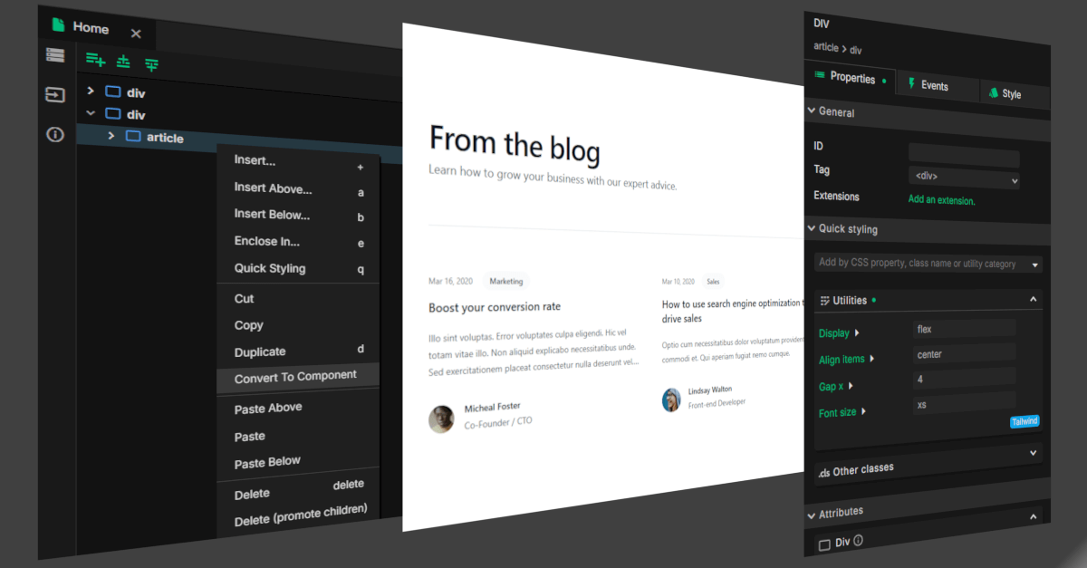
- Open the Home page in the template editor and delete two of the three
articleelements (no matter which two). - Select the remaining
articleelement and choose Cut from the context menu (*). - Right-click in the Design tab in the explorer pane and select New Component.
- Enter "PostInfo" as the name and choose OK.
- Choose Paste from the context menu to insert the contents from step 2.
* If you're on a Pro plan, you can choose Convert to Component from the context menu, avoiding the need to manually cut-and-paste elements or fix data bindings.

Preparing for dynamic data
Your selection has now been moved to a new component (for clarity, you can move it into the Blog folder). In a later step, we'll ensure this component can dynamically display data. But first, let's make sure the data can get to our new component.
- Open the PostInfo component in the template editor and open the data panel on the left of the template editor.

The PostInfo Data panel - In the Data panel, select Create a new property.
- Enter "post" as the name and select BlogPost as the type.

Creating a new "post" property - Since we are about to use the PostInfo component to display posts on the home page, the home page must be able to pass data to the PostInfo component. To enable this, locate the Fill From field in the property details of the new post property and select The parent component.

Fill "post" from the parent component
The next step is to configure the homepage. The project includes the BlogAPI API stub, which the homepage can use to retrieve a list of blog posts that it can pass to the PostInfo component.
- Open the Home page in the template editor, open the Data panel there, and select Create a new property.
- Enter "posts" as the name and select BlogPost as the type. Important: also check This property is a collection.
- Now locate the Fill From field in the property details and select An API call.
- For the API operation, choose "BlogAPI.ListPosts"".

Fill "posts" from an API call
We now want our post info to be displayed for each post in the posts collection (i.e., for each post returned by the API). For this, we will use a For each widget.
- Select the
PostInfoelement in the template editor and choose Enclose In... from the context menu. - Now select the For each widget in the Structural category and choose Next.
- For Collection, choose "posts" and confirm.
- Finally, open the details of the
PostInfoelement and find the post property you created in the previous step. Click the value (none) of this property and choose "posts -> blogPost" from the Bind to selection.
Making the PostInfo component data-driven
We've almost reached the goal of this how-to: we created a reusable PostInfo component that displays on the home page for every blog post passed through the BlogAPI. The final step is to ensure that this component also displays the data passed to it. In other words, we're going to implement data binding. It's helpful to open the live preview of your app via the Preview button in the top right corner of the designer. You'll now see the same blog post three times. At the end of this step, this information will be different for each blog post.
- Open the PostInfo component in the template editor and click on the
timeelement. - Now select Edit Text from the context menu (or press the 't' key).
- Under Bind to, select "post.PublicationDate" and confirm (and watch the publication dates change in the live preview).
- Repeat the previous three steps for:
- post.Title
- post.Tag
- post.Summary
- post.AuthorProfile.FullName
- post.AuthorProfile.Role
- Finally, open the details panel of the
imgelement and find the Source attribute. - Open the advanced editor by clicking the pencil icon to the right of the current value and choose to bind to "post.AuthorProfile.ImageUrl".
As you can see in the preview, our PostInfo component is now completely finished. Your template should now look like this:

Bonus: Navigating to the blog post page
Wouldn't it be nice if the user could now also click through to the blog post itself? The starter project also includes a sample BlogPost page that you can link to. You don't need to change anything on this page, but it's good to know how it works:
The BlogPost page, like the PostInfo component, has a post property. However, unlike the PostInfo component, this is a separate page that is responsible for retrieving its own data from the BlogAPI. So how does the BlogPost page "know" which blog post to display? Through a URL parameter! This postId parameter has already been added and can be found in the URL Parameters input panel on the left of the template editor. The post property is also configured to retrieve the correct blog post based on the postId parameter.

All you need to do now is ensure that the PostInfo component gets a so-called Page link to the BlogPost page, using the postId parameter. Follow these steps or watch the 30-seconds video below instead.
- Open the PostInfo component in the template editor and select the
link🔗 element that contains the post title (the first element below theH3). - Locate the Extensions field in the Properties panel and click Add an extension.
- Now select the Page link widget in the Navigation category and choose Configure.
- For Destination page, choose "BlogPost" and confirm.
- Now locate the Parameters field in the Properties panel and click
postId. - In the dialog that appears, select Bind to and select "post.Id"". This ensures that the ID of the current post is passed via the URL to the BlogPost page.
That's it. View the live preview of your app to test the navigation.
You learned how to easily incorporate Tailwind UI blocks into your dynamic, component-based web app, without having to change a single line of code. If you lost me along the way: check out the final project here. Did you find this post useful and did I inspire you to get started with Tailwind CSS? Then try one of these options - no strings attached:
- Create a Shoelace with Tailwind project using web components from Shoelace - check out this article for an introduction or create a new Shoelace with Tailwind app now.
- Create a Tailwind only project with no other dependencies - for when you don't need any other components. Create a new Tailwind-only project now.
Read next
Tailwind 4.3, New Claude Models, and API Mocking with MSW
Our designer now includes all utilities introduced in Tailwind CSS 4.2 and 4.3, including new color palettes, logical sizing and spacing utilities, mask effects, scrollbar styling, shadow color utilities, and more.
Building in-app navigation with JitBlox has become easier: file-based routing explained
Learn how building in-app navigation with JitBlox has evolved, including predictable paths, nested navigation, and path overrides — no code required.
Angular 21, smarter AI, and what's next for JitBlox
JitBlox now supports Angular 21, delivers a smarter AI assistant, improves previews, and adds new templates. React and Vue support are coming, moving JitBlox closer to a true cross-framework UI builder.
Accelerate no-code frontend development with JitBlox's new AI assistant
Our powerful visual designer now has AI integration! Accelerate AI-driven frontend development using leading UI libraries and without vendor lock-in.
JitBlox 1.5: Angular 20 support, new components and more UX improvements
Announcing JitBlox 1.5, featuring Angular 20 support, Bootstrap Offcanvas and Modal components and updates to make JitBlox even more user friendly.
Adding a Bootstrap Offcanvas or Modal to your Angular app without coding
Learn how to add a working Bootstrap Offcanvas or Modal component to your Angular project within a minute - without coding.
Comments powered by Talkyard.