Adding a Bootstrap Offcanvas or Modal to your Angular app without coding
In the most recent JitBlox release, we added two special components to our Bootstrap integration: the Offcanvas and Modal components. What makes these components special is that they are not initially visible to the user. Showing them requires a trigger - such as a button - and some additional JavaScript code to open the component when the button is clicked.
The Modal component is a popup dialog box or overlay window that appears on top of the main content to display important information, forms, confirmations, or any interactive content. The Offcanvas component is a sidebar-like panel that slides into view from the left, right, top, or bottom of the screen.
If you intend to use an Offcanvas or Modal without a web framework, you can make use of Bootstrap JavaScript combined with data attributes to provide a link between the trigger and the component. However, this is not an option when you are building a single-page-app, which is why I am pleased that with JitBlox you can now add both widgets to your Angular app with a few simple actions - without writing a single line of code.
If you're not familiar with JitBlox, it's a visual web app builder that lets you build working web apps without coding, leveraging leading UI libraries and front-end frameworks. JitBlox is an easy way for you and your team to quickly build new ideas and start your next web project with solid source code and UI components that developers are already familiar with.
The workflow for adding both components is similar, so let's elaborate for the better-known of the two: the Modal component. By the end of this guide, you'll have a ready-to-use Angular project. If you prefer, here is a short video showing the complete process of adding a working Modal with a launch button in just over 30 seconds:
Adding the Modal to your project
You can of course add a Modal to an existing JitBlox project, but for now we'll start with an empty project - create a new project and choose Blank Bootstrap App (I'll leave the name to your own imagination).
- In the template editor, click on the Insert button above the template and search for “Modal”.
- You should immediately see the first version of your Modal dialog now. Click Configure to set up some basic properties if you wish.
- Click Insert and see... nothing!
As expected, the Modal is hidden and waiting to be shown. Below is a helpful tip to make designing a hidden component a bit easier, but first let's add a button to test the Modal (note the Modal already does have working close buttons).
Adding a launch button
- Click the Insert (+) and search for “Button”.
- Choose Configure, enter “Launch Modal” as the content and choose Insert.
- With the new Button element selected, go to the Events tab in the details panel.
- Add a new Click event and choose Call a component method.
- In the next step, choose modal.open().
Now open the full app preview using the Preview button at the top right to see the interaction in action. This is the first version of your own Modal, with initial content and working open and close buttons. I leave the further elaboration of the content as an exercise for the reader.
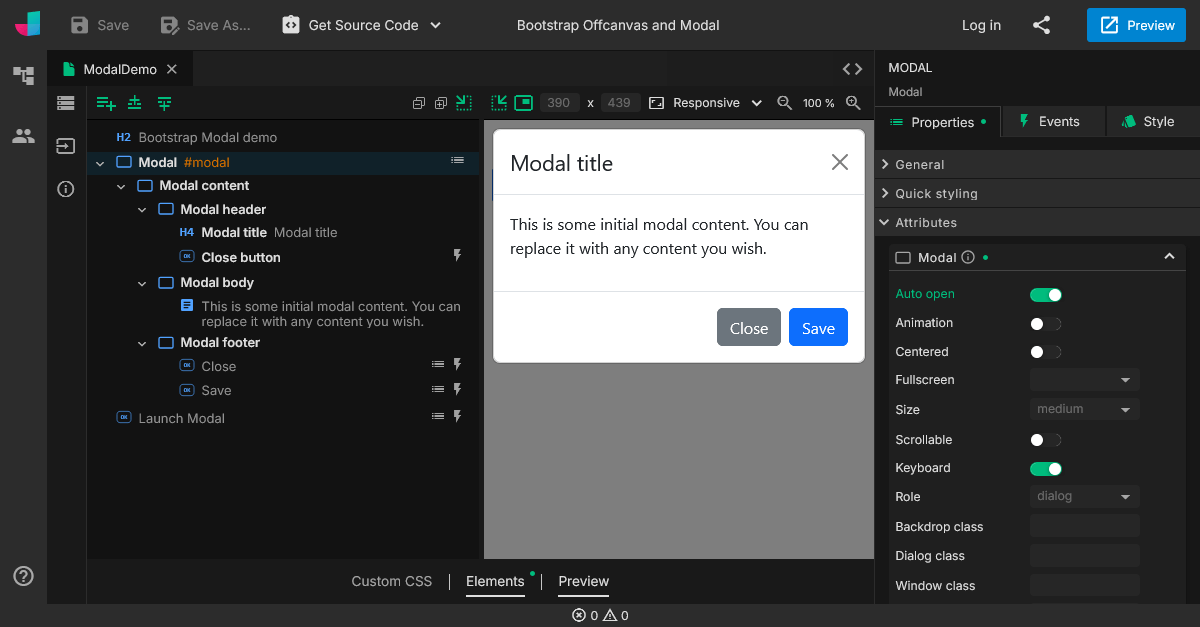
How to design initially hidden content
Opening the full app preview is of course a way to get live feedback while designing, but requires you to manually trigger the component every time you want to see how it looks. If you also wish to get live feedback in the designer, use the Auto open option:
With the Auto open option enabled, the Modal/Offcanvas will open immediately without user interaction. Turn this option on (temporarily) if you want to be able to see the element in the template preview as well.

This is all it takes to add a Bootstrap Modal to your Angular app without coding. You can also find the Angular project from this post in this GitHub repository.
Credits for Angular powered Bootstrap widgets to the ng-bootstrap library.
Read next
Tailwind 4.3, New Claude Models, and API Mocking with MSW
Our designer now includes all utilities introduced in Tailwind CSS 4.2 and 4.3, including new color palettes, logical sizing and spacing utilities, mask effects, scrollbar styling, shadow color utilities, and more.
Building in-app navigation with JitBlox has become easier: file-based routing explained
Learn how building in-app navigation with JitBlox has evolved, including predictable paths, nested navigation, and path overrides — no code required.
Angular 21, smarter AI, and what's next for JitBlox
JitBlox now supports Angular 21, delivers a smarter AI assistant, improves previews, and adds new templates. React and Vue support are coming, moving JitBlox closer to a true cross-framework UI builder.
Accelerate no-code frontend development with JitBlox's new AI assistant
Our powerful visual designer now has AI integration! Accelerate AI-driven frontend development using leading UI libraries and without vendor lock-in.
A guide to using Tailwind UI blocks in your component-based web app
In this step-by-step guide, you will learn how to get the most out of Tailwind CSS, and Tailwind UI blocks in particular, in your data-driven, component-based web app without coding.
JitBlox 1.5: Angular 20 support, new components and more UX improvements
Announcing JitBlox 1.5, featuring Angular 20 support, Bootstrap Offcanvas and Modal components and updates to make JitBlox even more user friendly.
Comments powered by Talkyard.