JitBlox 1.4: UX improvements, an enhanced template preview and more
Today I'm excited to announce JitBlox 1.4, offering a host of small but significant changes. In this version we've paid close attention to usability in several areas. For example, we have updated some key terms and icons to make JitBlox even easier to understand for less tech-savvy users, and our color palette has undergone an update that we hope you'll like. Furthermore, we have made a number of improvements to the template editor, including the ability to test responsive designs in the template preview.
If you're not familiar with JitBlox, it's a visual web app builder that lets you build working web apps without coding, leveraging leading UI libraries and front-end frameworks. JitBlox is an easy way for you and your team to quickly build new ideas and start your next web project with solid source code and UI components that developers are already familiar with.
Updated terminology
JitBlox once started as a tool for developers, and we're happy to see that more and more designers are finding their way to JitBlox too. Because of this history, the JitBlox UI still contained technical terms here and there that were not always clear to less tech-savvy users. This is why we have replaced them with names that are easier for everyone to understand. The most notable changes are:
| App (root) | → | Main layout | The top-level layout that wraps all pages. |
| Router Outlet | → | Page Area | Displays the content of the current page based on navigation. |
| Router Link | → | Page Link | Creates a link to another page within the app. |
| Route Parameter | → | URL Parameter | Allows passing variable input through a page's URL. |
| Design fragment | → | UI block | A pre-built UI block that can be added from the toolbox. |
These changes have also been adopted in our documentation. However, you may still encounter old terms in some screenshots.
Responsive design made easier
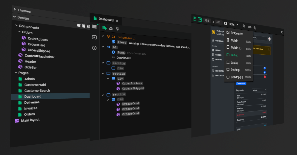
 size")
I'm also pleased to share that the template preview has been enhanced with a device selector to see how your design looks on various screen sizes. This is well known feature to many web developers and is very helpful for testing responsive CSS. It also had been on our wish list for a long time, but posed an additional challenge for JitBlox: unlike other design tools, JitBlox is designed to target any UI library - and different UI libraries often come with different sets of breakpoints.
We therefore chose to use a fixed set of names for screen sizes, but to adapt their widths to the UI library used. As a result, you will thus see slight differences between the device selector in, say, a Bootstrap project and a Tailwind project.
 and Tailwind (right) screen sizes")
Pages, components and main layout
We now also make a clearer distinction between the different types of custom components: As mentioned above, the top-level component is now called “Main layout”, and in addition we now also make a distinction between pages and components. Designing a page still works in exactly the same way as designing a component, but this distinction helps you better organize your projects and helps JitBlox provide better user experience in various places.

Converting existing projects to use Pages
Since pages and components technically work the same, all your current JitBlox projects will continue to work without any problems. When you first open an existing project in the new version, JitBlox will automatically convert the components that already have a Page Link pointing to them to a Page. This also applies to components that are in a "Pages" folder. You can easily convert any other components manually from the component information at the left of the template editor:

Other recent changes
Follow selection in the Elements pane
JitBlox already had a feature to highlight elements in the template preview by clicking them in the Elements pane. As of this release, this feature also works in the other direction, letting you find elements in the Elements pane by clicking on them in the preview.
By default, following your selection is active in both directions, and can be toggled separately for each direction via the and icons at the top of the template editor.
A collapsible output pane
The output pane - the pane that shows any errors and warnings encountered while generating your app - can now be expanded/collapsed and is collapsed by default. This gives you quite a bit of extra space for your design work, and if there are any problems, you can now tell by the status indicator at the bottom of the screen.

An SVG widget
Because it is sometimes useful to add inline SVG markup to your design (think icons that are not in a supported icon library), we have added an SVG widget. Included with this widget is a simple XML/SVG editor where you can manually paste and edit SVG source code.

Tailwind UI blocks
We've added a number of ready-to-use UI blocks for use in your Tailwind projects. The UI blocks are inspired by publicly available Tailwind components and UI blocks and can now be added to your design with a single click.

Join the conversation
We encourage you to share your feedback with us, good or bad, by submitting issues or leaving a comment on this post. This will help us improve JitBlox and fine-tune our roadmap, so please let us know what you think.
Read next
Tailwind 4.3, New Claude Models, and API Mocking with MSW
Our designer now includes all utilities introduced in Tailwind CSS 4.2 and 4.3, including new color palettes, logical sizing and spacing utilities, mask effects, scrollbar styling, shadow color utilities, and more.
Building in-app navigation with JitBlox has become easier: file-based routing explained
Learn how building in-app navigation with JitBlox has evolved, including predictable paths, nested navigation, and path overrides — no code required.
Angular 21, smarter AI, and what's next for JitBlox
JitBlox now supports Angular 21, delivers a smarter AI assistant, improves previews, and adds new templates. React and Vue support are coming, moving JitBlox closer to a true cross-framework UI builder.
Accelerate no-code frontend development with JitBlox's new AI assistant
Our powerful visual designer now has AI integration! Accelerate AI-driven frontend development using leading UI libraries and without vendor lock-in.
A guide to using Tailwind UI blocks in your component-based web app
In this step-by-step guide, you will learn how to get the most out of Tailwind CSS, and Tailwind UI blocks in particular, in your data-driven, component-based web app without coding.
JitBlox 1.5: Angular 20 support, new components and more UX improvements
Announcing JitBlox 1.5, featuring Angular 20 support, Bootstrap Offcanvas and Modal components and updates to make JitBlox even more user friendly.
Comments powered by Talkyard.