Building a data-bound Bootstrap Accordion
The Bootstrap Accordion is a popular user interface component used in web development to manage and present collapsible content panels. It allows users to toggle between showing and hiding content sections with a click, typically organized into a list of clickable headers (accordion items) that expand or collapse their associated content when clicked.
In this tutorial, we'll guide you through creating a data-bound Bootstrap Accordion with JitBlox, without writing any code. We'll use Angular 17 with ng-bootstrap for this project, and you can find the resulting Angular code on GitHub.
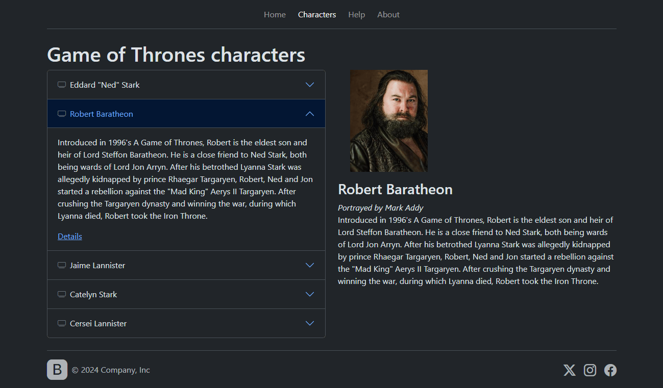
First, we'll add a Bootstrap Accordion to the project, which is as simple as clicking a few buttons. Next, we'll make our Accordion dynamic by displaying a list of Game of Thrones characters. Then, we will enhance our Accordion by adding a "detail view" feature. This will allow us to see a photo and description of the selected character. Once we're done, the final application will look something like the image below (and your project will look similar to this project):
That's it! Let's dive in and create our Bootstrap Accordion with Angular.
Getting started
To kick things off, let's grab a copy of the starter template for this tutorial:
- Make sure you are logged in.
- Open the tutorial's starter project in the designer.
- Hit the "Save As..." button at the top to get your own copy of the project.
- Click on "Live Preview" to see how the initial application looks.
The starter template comes with a few things already set up:
- Main Layout: This component is the "root" component of your app that contains a header for navigation and a Page Area for displaying the current page.
- Dark Theme: The project uses the Bootstrap Dark theme by default, but you can switch to the light theme if you prefer.
- Data Model: There's a
Charactertype that we will use to represent a Game of Thrones character. - CharacterDetail component: This component is used to display details of a character.
- CharactersPage component: This is the page we'll focus on initially.
1. Adding the initial Accordion
Let's start by adding an Accordion to the CharactersPage component. This page has a two-column Bootstrap Grid layout that is still empty. We will add our Accordion to the first column.
- Open the CharactersPage component.
- To add the Accordion, select the first div marked as a Grid column, open the context menu, and choose "Insert..." (+).
- In the dialog, find the Accordion widget and click "Insert..." (we won't do any further configuration for now).
- Check the Live Preview to see the Accordion added.
You will notice that by default, all panels can open simultaneously. To change that, find the Accordion's "Close others" property and enable it.
2. Modifying the Accordion to show dynamic data
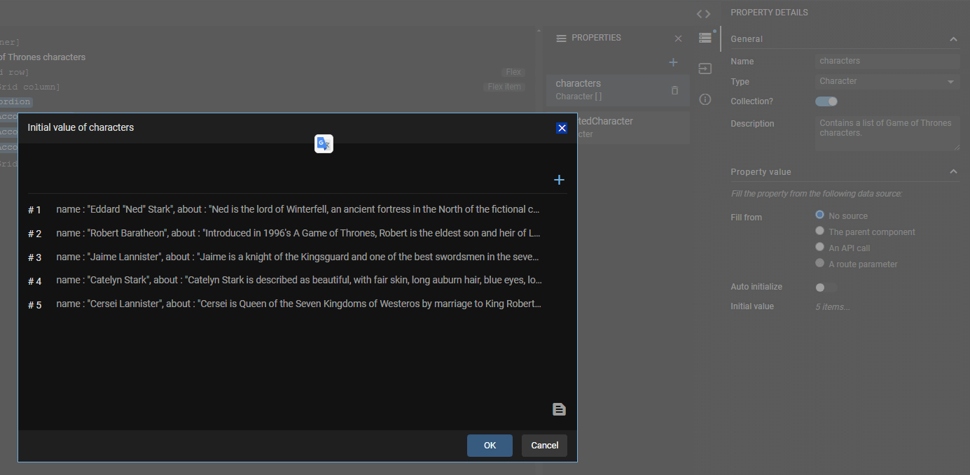
In a typical web app, our data would be fetched from a backend and we could have set up an API Stub to simulate a backend. For this tutorial, we'll keep it simple: The CharactersPage component has a property named "characters" that is already set up with sample data. You can see the data by opening the component properties from the sidebar at the right of the component template. Open the "characters" property and inspect its Initial value to see our sample data.
Now, let's make our Accordion dynamic and throw in some Game of Thrones data.
- Delete 2 out of three Accordion items.
- Select the remaining Accordion item and choose "Enclose in...".
- Find the Structural -> For each widget and click "Next"
- Select
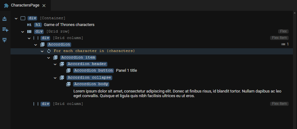
charactersas the source and confirm. Your template should now look as follows:
Next, update the title and body to reflect the actual data:
- Select the Accordion button and choose Edit Text (t).
- Choose "Bind to" and select
characters -> character.namefrom the dropdown. - Repeat these steps for the Accordion body, but instead bind it to
characters -> character.about.
Fast track of steps 1 and 2: how we could have gotten here even faster
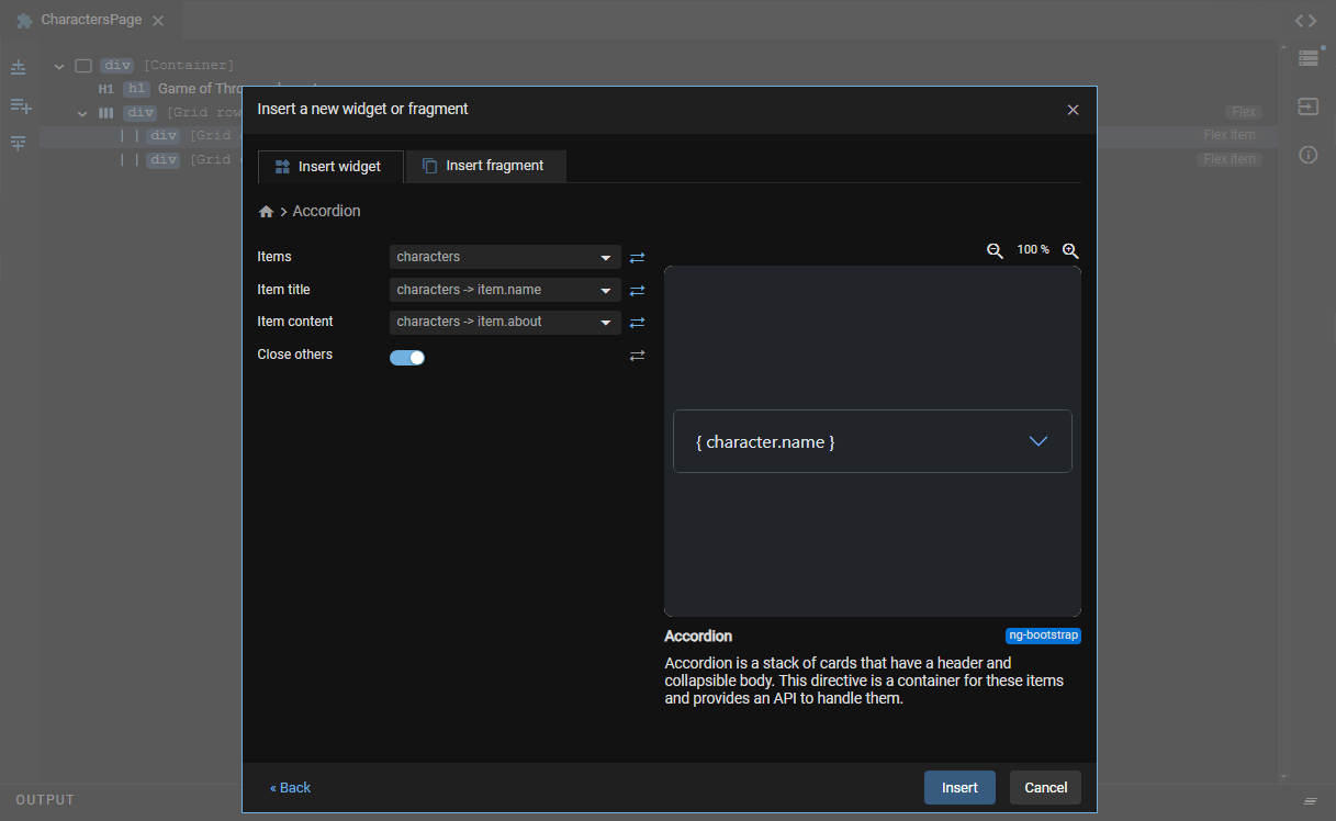
For the sake of learning, we didn't opt for the fastest route here! When we added our initial accordion, we just went with the default settings, which resulted in some static Accordion panels as a mere starting point. However, we could've chosen the correct data source right from the start in the Configure step! Feel free to try this yourself (use the data-binding icons at the right of each input):
3. Enhancing the Accordion
Let's make our Accordion a bit more informative by adding an icon to each Accordion header:
- With the Accordion button selected, choose "Insert..." (+).
- Search for "icon" and then select "tv" as icon (or any other icon that you think would be appropriate). For the Color, choose "secondary".
- Insert the icon and drag it above the character name. Now only need to add some spacing:
- In the properties pane, go to "Find a CSS utility or property", search for "Margin end" and select it.
- Then, select one of the predefined margins (a value of 2 will do).
4. Bonus: showing character details next to the Accordion
For an added feature, let's integrate the CharacterDetail component that should show up when the user clicks a "Details" link after each summary:
Find the second (still empty) grid column and choose "Insert..." (+).
- Find the If-condition and click "Next".
- In the expression dropdown, select
selectedCharacterand confirm. - With the If {selectedCharacter} selected, choose "Insert..." (+).
- Find the CharacterDetail component and click "Configure".
- In the dropdown that appears, set the character input to
selectedCharacter.
Next, we will add a "Details" link to each Accordion body.
- Select the Accordion body and choose "Enclose Text In...".
- Find the Paragraph widget and confirm.
- With the new paragraph selected, choose "Insert Below..." (b).
- Find the Hyperlink widget and click "Configure".
- For the Link text, enter "Details".
Finally, let's set up an event to display character details upon clicking.
- With the Details link selected, open the Events tab in the right pane and find the "click" event.
- Click the "none" text next to the "click" event and select "Update a Property" from the context menu.
- In the first dropdown, select
selectedCharacter. - In the second dropdown, select
characters -> character. - Now check out the Live Preview, expand one of the Accordion panels, and click "Details".
That's it! You're now ready to navigate through your Bootstrap Accordion with dynamic content in your Angular project.